PACKAGING
Australis
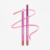
This project involved developing a packaging redesign for Australis that refreshed the brand while remaining connected to its heritage. Rather than introducing an entirely new visual direction, the concept drew inspiration from Australis’ earlier identity, revisiting the iconic hot pink aesthetic that originally established strong brand recognition and emotional connection with consumers.
Research identified that a significant portion of Australis’ customer base consists of women now in their 40s who have remained loyal to the brand since discovering it in their teenage years. This insight informed a strategy centred on balancing nostalgia with relevance; reintroducing familiar visual cues to reconnect with long-term customers while simultaneously creating renewed appeal for a younger generation entering the category.
The redesign leverages Australis’ distinctive colour heritage as a recognisable brand asset, creating packaging that feels both contemporary and familiar. By revisiting the aesthetic that first resonated with consumers in the 1990s, the concept celebrates Australis’ identity as an iconic Australian beauty brand while strengthening emotional connection across generations.
Introducing: Luscious Lips That Love You Back! This launch marks an exciting new chapter as Australis approaches 40 years of beauty.